

How to Build a Consistent Brand Identity Across Digital Platforms
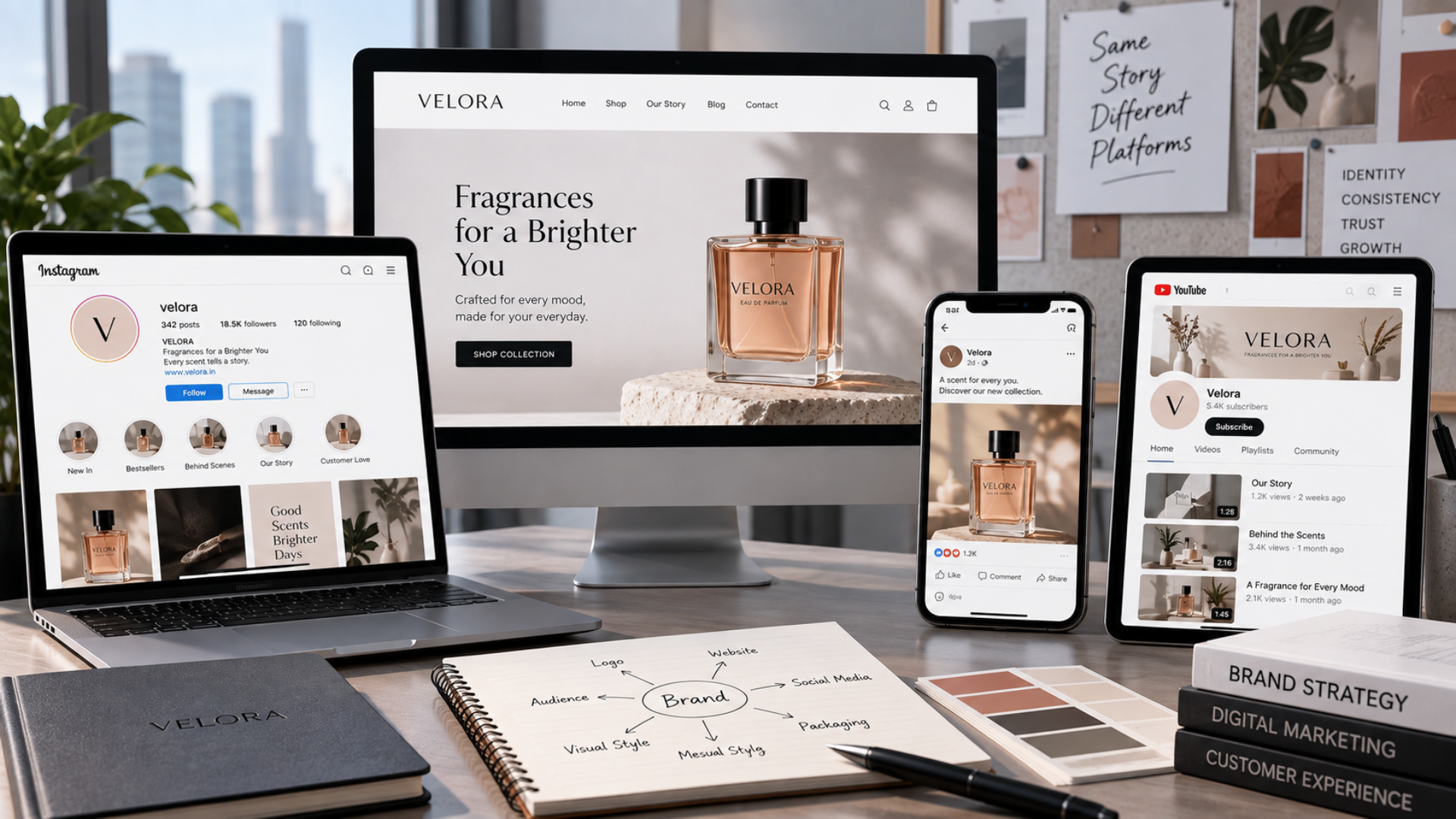
A customer may discover your business through an Instagram post today, visit your website tomorrow, see one of your advertisements a week later, and eventually receive an email or presentation from your team. Although these interactions happen on different platforms, the customer does not think of them as separate experiences. To them, every interaction is part of the same brand. That is why brand consistency matters.
If your Instagram presence feels modern and premium but your website looks completely different, the experience becomes disconnected. If advertisements use one style of communication while emails use another, customers may struggle to develop a clear impression of the business. Even relatively small inconsistencies in colours, typography, imagery, messaging, or tone can gradually make a brand feel less recognizable.
Building a consistent brand identity does not mean making every platform look identical. Instagram, LinkedIn, a mobile app, an email campaign, and a website all have different purposes and formats. The goal is to make sure that wherever someone interacts with the business, they can recognize the same underlying identity.
Creating that consistency requires more than a logo. It requires a clear understanding of what the brand represents, how it looks, how it communicates, and how those principles should adapt across different digital environments. This blog explains how businesses can build a consistent digital brand identity without making every platform feel repetitive.
Start With What Your Brand Actually Represents
Before choosing colours, fonts, templates, or social media layouts, a business needs clarity about the brand itself. What does the company want to be known for? Who is it trying to reach? What qualities should customers associate with it? How should someone feel after interacting with the brand? These questions influence almost every decision that follows.
A premium interior design company, for example, may want its identity to communicate sophistication, attention to detail, and exclusivity. A technology startup may want to appear innovative, approachable, and efficient. A children’s education brand could prioritize warmth, simplicity, and trust.
Without this foundation, visual decisions often become based purely on personal preference. Someone likes blue, so blue becomes the brand colour. Someone sees a particular Instagram style trending, so the company begins copying it. Six months later, another visual trend appears and the brand changes direction again.
A strong identity works differently. Design decisions are connected to the personality and positioning of the business. Before expanding the brand across digital platforms, define its core positioning, audience, personality, values, and communication style. These elements become the reference point for deciding whether something genuinely feels like the brand.
Create a Visual System, Not Just a Logo
One of the most common misunderstandings about branding is treating the logo as the complete visual identity. A logo is important, but customers encounter far more than the logo when interacting with a business online. They see colours, typography, photography, graphics, icons, layouts, buttons, advertisements, presentations, social posts, and sometimes product interfaces.
Together, these elements create the visual language of the brand. A practical brand system should therefore define primary and secondary colours, typography choices, logo variations, spacing principles, image direction, icon styles, graphic elements, and other recurring design characteristics.
Consider what happens when these decisions are not documented. One designer uses a dark version of the primary colour while another uses a brighter variation. Social posts use one font, advertisements use another, and the website introduces a third. Photography alternates between highly polished studio images and unrelated stock photographs. None of these choices may look particularly bad individually, but together they weaken recognition.
Consistency comes from creating rules that are clear enough to guide design without restricting creativity. At Hakimi Solutions, branding work can therefore extend beyond producing individual visual assets. The stronger objective is creating an identity system that can continue working as the business expands into new campaigns, platforms, and digital experiences.
Define How Your Brand Sounds
Visual consistency is only half of brand identity. A business can use exactly the same colours and logo everywhere and still feel inconsistent if its communication changes dramatically between platforms. Brand voice defines how the business communicates. Is the brand formal or conversational? Does it use technical language or explain concepts simply? Is its communication energetic and bold, or calm and understated? Does it use humour? How direct should calls to action be?
These decisions should remain recognizable across customer touchpoints. Imagine a financial services company whose website communicates in a professional and reassuring way, while its social media suddenly uses aggressive slang and exaggerated promotional language. Even if both approaches are individually well written, the shift can make the brand feel uncertain about its identity. Consistency does not require copying identical sentences everywhere. The tone can adapt according to context.
A LinkedIn article may naturally be more detailed than an Instagram caption. A customer-support message should be more direct than an advertising campaign. A push notification needs to be shorter than an email. The format changes, but the personality behind the communication should remain recognizable. Creating simple voice guidelines helps everyone producing content understand what the brand should and should not sound like.
Adapt the Identity Instead of Copying It Everywhere
A consistent brand is not the same as an identical brand. Every digital platform has its own environment, audience behaviour, dimensions, and content formats. Trying to force exactly the same design onto every platform can make the brand less effective rather than more consistent. Instagram is highly visual and fast-moving. LinkedIn often allows more professional or educational communication. Email gives businesses space for longer messages and personalized communication. A mobile app needs to prioritize usability and interaction. Digital advertisements may have only a few seconds to communicate one idea.
The identity therefore needs to adapt while preserving its recognizable elements. For example, a brand may use large typography and minimal copy in Instagram creatives while using the same typography system more functionally within a website or app. An advertisement may use the brand’s primary colour more prominently, while an email could use it only for headings and calls to action. The design does not need to be duplicated. It needs to feel related. A useful test is to temporarily remove the logo. If the remaining colours, typography, imagery, messaging, and design language still feel recognizable, the brand identity is doing more than depending on its logo.
Make Social Media Feel Like One Brand
Social media is often where brand inconsistency becomes most visible because content is produced frequently. A business may publish promotional creatives, educational posts, Reels, announcements, testimonials, festival content, hiring posts, and behind-the-scenes material within the same month. Without a clear visual and communication system, every post can begin looking like it belongs to a different company. The solution is not to use one rigid template for everything.
That creates a different problem: the profile becomes repetitive and every piece of content starts looking interchangeable. Instead, businesses should define a flexible social media system. Typography, colours, graphic treatments, image direction, spacing, and tone can remain consistent while layouts change according to the content. A testimonial should not necessarily look like a product announcement. An educational carousel should not need the same composition as a festival post. What connects them is the underlying design language.
The same principle applies across social networks. Content may be adapted for Instagram, Facebook, LinkedIn, or other platforms, but the customer should not feel as though an entirely different team or brand appears on each one. This is where branding and social media management need to work together. Creating posts without an established identity makes consistency increasingly difficult as content volume grows.
Keep Paid Advertising Connected to the Brand
Performance campaigns often create another consistency problem. Because advertisements are heavily focused on generating clicks, leads, or purchases, businesses sometimes allow performance creatives to drift away from the main brand identity. New colours appear because they are considered attention-grabbing, typography changes, messaging becomes more aggressive, and the advertisement begins looking unrelated to the company’s normal digital presence.
That can create a disconnect after the click. A person sees one style in an advertisement and then lands on a page or profile that feels completely different. Even when the offer is legitimate, the sudden change can reduce familiarity and confidence. Performance and branding should therefore support each other rather than operate as separate disciplines.
An advertisement still needs enough creative freedom to communicate quickly and attract attention, but the visual language and messaging should remain connected to the business behind it. Colours, logo treatment, imagery, typography, and voice can provide that connection without forcing every advertisement into an identical layout.
Hakimi Solutions’ work across branding, creative design, social media, and performance marketing can be particularly valuable here because these areas influence one another. When campaign creatives and the broader brand system are developed with the same direction, customers experience a more coherent journey from first impression to conversion.
Carry the Same Identity Into Websites and Apps
Although brand consistency extends far beyond websites, websites and applications remain important digital touchpoints because customers often spend more time interacting with them. A website should not simply place the company’s logo at the top and consider the branding complete. Typography, colour hierarchy, photography, icons, spacing, buttons, forms, illustrations, and even the way information is presented should reflect the identity.
The same principle applies to mobile applications. Branding within an app needs to work alongside usability. Buttons still need to be clear, navigation needs to remain intuitive, and information hierarchy should make sense. Visual identity should support the experience rather than making the interface difficult to use.
This is where branding and UI/UX design meet. A strong digital identity is not something placed on top of an interface after it has been designed. It should influence the interface from the beginning while respecting the practical requirements of the platform. When social media, advertisements, the website, and the app all use a related visual and communication system, customers begin building familiarity regardless of where they interact with the company.
Do Not Forget Everyday Digital Communication
Some of the most frequently seen brand touchpoints are also the easiest to overlook. Email signatures, proposals, quotations, presentations, brochures, newsletters, sales documents, recruitment material, and customer communication may all contribute to the impression customers form about a company.
Imagine receiving a polished advertisement from a business, visiting an equally polished social profile, and then receiving a poorly formatted proposal using completely different fonts and colours. The proposal may contain excellent information, but the overall experience has suddenly become less cohesive. These smaller touchpoints are especially important for B2B companies, where customers may interact with sales material and business documents repeatedly before making a decision.
Creating reusable templates can solve much of this inconsistency. Instead of employees designing documents independently every time, the business can provide approved presentation layouts, proposal formats, email signatures, social templates, and other common assets. The objective is not to make employees think about branding every time they send something. It is to create a system where following the brand becomes the easiest option.
Build Brand Guidelines People Can Actually Use
Brand guidelines are useful only when the people creating content can understand and apply them. A document containing hundreds of pages of design theory may be appropriate for a very large organization, but many businesses need something much more practical. Useful guidelines should clearly show how the logo can be used, approved colour values, typography hierarchy, image direction, graphic styles, brand voice, and examples of correct and incorrect usage. Digital-specific guidance is particularly valuable.
How should the logo appear on social media creatives? What does a standard call-to-action button look like? Which font weights should be used for headings? How should photographs be treated? What kind of language should captions avoid? How should advertising creatives adapt the brand? Clear examples remove interpretation.
Brand guidelines also become increasingly important as more people become involved. A founder may intuitively know what feels “on brand,” but a new designer, marketing employee, freelancer, agency, or development team cannot be expected to share that intuition without direction. Documenting the identity turns personal preference into a repeatable system.
Create Templates Without Making Everything Look the Same
Templates are one of the easiest ways to maintain consistency, but they can be overused. If every social post has the same heading position, image placement, background, and call-to-action block, customers quickly begin recognizing the template rather than the content. A better approach is to create a family of templates.
There might be one visual approach for educational content, another for product communication, another for testimonials, and another for announcements. They can use different compositions while sharing the same typography, colour system, spacing principles, and graphic language.
The same approach can extend to presentations, email campaigns, advertisements, and other recurring digital assets. Templates should make consistency easier, not eliminate creativity. The strongest brand systems provide enough structure that a designer knows the boundaries while still having room to create something appropriate for the message.
Review Your Digital Presence as a Customer Would
Brand inconsistency often develops gradually. A website may have been redesigned two years ago while social media evolved more recently. An old brochure remains in circulation. Different advertising campaigns introduce slightly different visual styles. A presentation created for one sales meeting becomes the unofficial template for the entire team.
Because these changes happen separately, the business may not notice how fragmented the overall experience has become. A periodic digital brand audit helps reveal those differences. Review the website, social profiles, advertisements, email communication, mobile applications, sales presentations, downloadable documents, and other important customer-facing assets together rather than individually.
Look for differences in logo usage, colours, fonts, photography, messaging, tone, calls to action, and general visual quality. The objective is not to identify tiny differences and remove them all. It is to determine whether those differences feel intentional or accidental. A brand should be flexible enough to adapt. What it should not feel is random.
Consistency Does Not Mean Refusing to Evolve
Brand consistency is sometimes interpreted as a rule that nothing should ever change. That is not the goal. Businesses evolve, audiences change, products expand, and design standards move forward. A brand created several years ago may eventually need refinement or even a larger rebranding exercise. The important thing is to evolve intentionally.
Gradually introducing random new colours, fonts, messaging styles, and visual trends creates inconsistency. Updating the brand system as a whole creates evolution. When a refresh is required, businesses should consider how the updated identity will work across the complete digital environment rather than redesigning one touchpoint in isolation. That means asking how the new direction will translate into social media, advertisements, digital interfaces, email communication, presentations, marketing material, and future campaigns. The strongest identities are not frozen in time. They have enough structure to remain recognizable while giving the business room to grow.
How Hakimi Solutions Can Help Build a Connected Digital Identity
Creating a logo is one project. Building a brand that remains recognizable across dozens of digital interactions is an ongoing system. That requires branding, design, content, UI/UX, social media, and marketing to work from a shared direction rather than functioning as unrelated activities.
Hakimi Solutions works across these digital touchpoints, which makes it possible to approach brand identity beyond a single asset or platform. From establishing visual direction and creating digital creatives to translating the identity across social media, UI/UX, applications, campaigns, and other customer-facing experiences, the focus can remain on building one recognizable brand.
For businesses that already have an established identity, the objective may not require starting again. Sometimes the larger opportunity is identifying where the existing brand has become inconsistent and creating a clearer system for applying it going forward. For newer businesses, establishing those rules early can prevent years of fragmented design and communication later. In either case, consistency becomes easier when every digital decision has a common foundation.
Wrapping It Up
Customers rarely experience a brand in one place. They move between social media, advertisements, search results, emails, websites, apps, presentations, and direct communication, often without consciously thinking about the transition. Each interaction contributes something to their overall perception of the business. A consistent brand identity makes those interactions feel connected.
Achieving that consistency requires more than repeating a logo or using the same colour everywhere. Businesses need a clear brand foundation, a flexible visual system, a recognizable voice, practical guidelines, reusable templates, and an understanding of how the identity should adapt to different digital environments.
Social media should have room for creative variety without losing recognition. Advertising should be optimized for performance without looking disconnected from the company behind it. Websites and applications should translate the identity into functional experiences, while everyday documents and communication should receive the same level of attention.
Most importantly, consistency should not make a brand rigid. The goal is to create enough structure that the brand can change, experiment, and grow without losing the qualities that make it recognizable. When every digital touchpoint feels like part of the same business, customers do not have to repeatedly figure out who they are interacting with. Over time, that familiarity becomes one of the most valuable things a strong brand identity can create.