

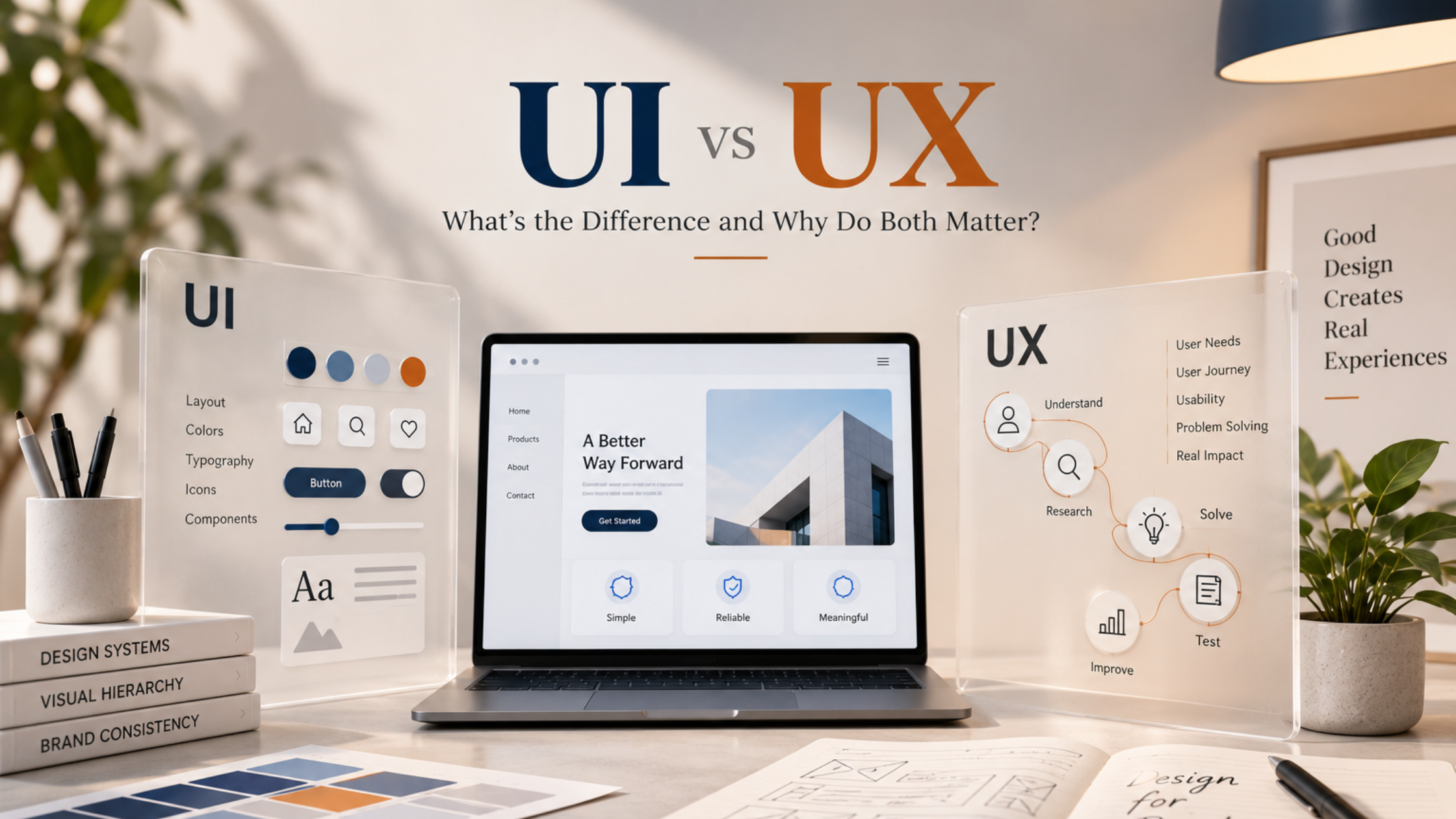
UI vs UX
When businesses start designing a website, mobile application, software platform, or another digital product, two terms come up repeatedly: UI and UX. They are often mentioned together and sometimes even used as though they mean the same thing. While they are closely connected, they focus on different parts of the digital experience. UI stands for User Interface, while UX stands for User Experience. UI focuses on the visual and interactive elements people use on a screen, while UX considers the broader experience of using the product and completing a task.
Understanding the difference matters because a digital product can look impressive and still be frustrating to use. It can also be easy to navigate but visually outdated, inconsistent, or difficult to understand. A successful digital experience needs to consider both how the product looks and how effectively it helps people accomplish what they came to do. For businesses, UI and UX are therefore much more than design terminology. They influence how customers interact with a digital product, how easily they find information, how confidently they complete important actions, and how they perceive the business behind the experience.
So, what exactly separates UI from UX, and why does a strong digital product need both?
What Is UI Design?
User Interface design focuses on the visual and interactive elements through which someone uses a digital product. Think about opening a mobile application. The colours you see, the typography, the buttons you tap, the icons used for navigation, the spacing between sections, the appearance of forms, and the way different screens visually connect are all part of the user interface.
UI design therefore includes decisions around colour palettes, typography, buttons, icons, menus, forms, images, layouts, spacing, visual hierarchy, and different interactive states. The objective is not simply to make something attractive. A well-designed interface should make information easier to understand and actions easier to recognize. For example, an important call-to-action should visually stand out from secondary actions. Headings should help users scan information. Buttons should look interactive. Form fields should be clearly distinguishable, and error messages should be noticeable without overwhelming the entire screen.
UI design also helps translate a company’s brand identity into a digital environment. Colours, typography, imagery, icons, and other visual elements can make an application or digital platform feel connected to the wider brand. However, a beautiful interface does not automatically mean the product provides a good experience. That is where UX becomes important.
What Is UX Design?
User Experience design looks beyond the appearance of individual screens and focuses on what happens when someone actually tries to use the product. Can users find what they need? Do they understand where to go next? Are they being asked to complete unnecessary steps? Is important information available at the right moment? What happens when something goes wrong? These are UX questions.
Imagine a customer wants to book an appointment through a mobile application. The application may look excellent, but the customer has to navigate through several menus before finding the booking option. After choosing a service, they must create an account before seeing available times. The form requests unnecessary information, and once it is submitted, there is no clear confirmation that the booking succeeded. The interface could still be visually beautiful, but the overall experience would be frustrating.
UX design examines the complete journey and considers how it can be made clearer, easier, and more intuitive. This can involve user research, information architecture, navigation planning, user journeys, wireframes, prototypes, interaction design, testing, and continuous improvement. Good UX often feels almost invisible. Users may not consciously think about how well a process was designed. They simply complete what they came to do without unnecessary confusion.
UI vs UX: What Is the Actual Difference?
A useful way to understand the distinction is to think of UI as what users see and interact with, while UX considers how the overall interaction works and feels. Consider an online checkout. The UI includes the appearance of the checkout screen: its button styles, typography, colours, input fields, icons, spacing, and visual hierarchy. The UX considers whether customers understand the checkout process, how many steps they need to complete, whether they can easily edit their information, whether errors are clearly explained, whether payment options are easy to find, and whether they know when their order has been successfully placed.
Both influence the customer, but they do so differently. The same applies to a mobile banking application. Modern colours, polished icons, clean cards, and attractive typography may create an excellent interface. However, if transferring money requires navigating through confusing menus or users struggle to find their transaction history, there is still a UX problem.
The reverse can happen as well. An application might be logically organized and easy to navigate, but inconsistent typography, poor spacing, outdated icons, or unclear visual hierarchy can make the product feel less polished. UI and UX solve different problems, but they contribute to the same overall experience.
Why Good UI Alone Is Not Enough
Businesses sometimes focus heavily on visual appearance because it is the most immediately noticeable part of a digital product. A redesign might introduce cleaner typography, attractive graphics, modern colours, larger imagery, and polished animations. The result looks considerably better in screenshots and presentations. But customers do not simply look at screenshots. They use the product.
If someone cannot find an important feature, struggles to understand navigation, encounters a complicated form, or has to repeat information unnecessarily, visual polish cannot remove that frustration. Consider a food-ordering application with beautiful photography and an elegant interface. If customers struggle to find their cart, cannot easily customize an order, or only discover important charges at the final stage, the underlying experience still creates friction.
This is why design decisions should not begin and end with appearance. Businesses need to understand what users are trying to accomplish, which information they need, which actions matter most, and where unnecessary steps can be removed. UI should then help communicate those decisions visually.
Why Good UX Still Needs Strong UI
The opposite is equally important. Imagine an application where navigation makes sense, forms are short, information appears in a logical order, and important tasks are easy to complete. From a functional perspective, the experience is strong. However, the application uses inconsistent fonts, poor spacing, unclear buttons, outdated visual elements, and colours that do not fit the brand.
The product may technically be easy to use, but it can still feel unfinished or difficult to scan. Visual quality affects how information is interpreted. A clear interface can help users recognize important actions, distinguish between primary and secondary information, and understand what they should do next. Strong UI therefore supports UX by making the intended journey visually clear.
If one action is more important than another, the interface can communicate that through hierarchy. If certain information is secondary, typography and spacing can reduce its visual weight. If a process has multiple stages, visual indicators can help users understand where they are. This is why UI and UX should not be treated as competing priorities. They need to support one another.
How UI and UX Work Together
The strongest digital products are usually designed by considering UI and UX as connected parts of the same process. Imagine designing an appointment-booking application. UX planning might establish a journey such as:
Choose Service → Select Date → Choose Time → Enter Details → Confirm Booking
The team can then determine what information is required at each stage, whether any steps can be combined, what happens when no appointments are available, and whether users can return to an earlier step without losing their information. Once the journey is clear, UI design translates that structure into screens people can understand.
Available dates should look different from unavailable dates. A selected time needs a clear visual state. The primary action should stand out. Form labels need to be readable, and the final confirmation should clearly communicate that the booking has been completed. UX establishes much of the logic behind the experience, while UI helps communicate that logic visually. Working on both together creates a stronger result than designing attractive screens first and trying to fit the user journey around them later.
UI and UX Go Beyond Websites
UI and UX are often discussed in relation to websites, but the principles apply to almost every digital product people interact with. Mobile applications are an obvious example. Limited screen space makes navigation, hierarchy, touch interactions, readability, and simplicity particularly important. Something that works comfortably on a desktop may become frustrating when placed on a smaller mobile screen.
Software platforms and dashboards also depend heavily on thoughtful UI/UX. These products often contain large amounts of information and functionality, making clear navigation, understandable labels, consistent interactions, and sensible grouping particularly important. Customer portals, booking systems, eCommerce applications, business software, digital forms, dashboards, and other interactive products all involve UI and UX decisions. The context changes, but the fundamental question remains the same: What is the user trying to accomplish, and how can the product make that task easier to understand and complete?
Common UI Mistakes That Affect the Experience
Not every interface problem requires a complete redesign. Sometimes relatively small visual decisions create unnecessary difficulty. Poor visual hierarchy is a common example. When headings, buttons, labels, and secondary information all have similar visual weight, users may struggle to determine what deserves attention first. Inconsistent design creates another problem. If the same type of button appears differently across multiple screens, users repeatedly have to interpret what each element means. Consistency allows people to gradually learn how the interface works.
Readability also matters. Very small text, insufficient spacing, long blocks of information, or overly decorative typography can make an interface visually interesting but tiring to use. Another common mistake is excessive visual complexity. Adding more animations, graphics, cards, effects, or decorative elements does not automatically create a better interface. Good UI design is not about adding as much design as possible. It is about helping users understand the right information and actions at the right time.
Common UX Mistakes That Create Friction
UX problems frequently appear when a business understands its own system extremely well and assumes customers will understand it in the same way. Complicated navigation is one example. Internal teams may know exactly where a particular feature is located, while a first-time user may have no idea which menu or terminology to look for. Long forms create another common problem. Businesses sometimes request every piece of customer information they might eventually need rather than asking only for what is necessary at that particular stage.
Unclear system feedback can also cause frustration. After clicking a button, users should understand whether something is loading, has completed successfully, or has failed. If nothing appears to happen, they may repeat the action or abandon the process. Error handling is equally important. A generic message such as “Something went wrong” provides little direction. Whenever possible, the experience should help the user understand what happened and what they can do next. Individually, these issues may appear minor. Together, they determine whether using a digital product feels natural or unnecessarily difficult.
Good UI/UX Starts With Understanding the User
One of the biggest design mistakes a business can make is designing primarily around internal preferences. A founder prefers a particular layout. The marketing team wants several promotional elements on one screen. The development team prefers a certain structure because it is easier to build. These considerations may matter, but the people actually using the product should remain central to the design process. Different audiences behave differently.
A B2B software platform used daily by experienced professionals may support more advanced controls and information. A consumer application designed for quick transactions may require a simpler journey. A product serving a broad age range may require additional attention to readability, clarity, and accessibility.
Understanding users helps determine what should be prominent, what can remain secondary, which terminology makes sense, and how much guidance is necessary. This is why effective UI/UX design involves more than creating attractive screens. Research, user journeys, wireframes, prototypes, testing, and iteration can help teams identify problems before they become expensive to correct during or after development.
How Do You Know Your UI/UX Needs Improvement?
Businesses do not necessarily need to wait until customers explicitly complain about design. User behaviour can reveal problems. If people regularly abandon a process at the same stage, struggle to complete forms, contact support for tasks that should be self-explanatory, or repeatedly ask where a feature is located, the experience may need investigation.
Problems can also appear when functionality has been added gradually over time. Navigation becomes crowded, screens accumulate options, and new features are placed wherever space is available rather than where users naturally expect to find them. Visual inconsistency is another signal. If different areas of a digital product appear to follow completely different design systems, the interface may need a more unified direction. The objective is not to redesign a product simply because it has existed for several years. The goal is to identify whether the current interface and experience still support the needs of users and the objectives of the business.
Why UI/UX Is Also a Business Decision
UI/UX may sound like a concern reserved for designers, but its effects can extend much further. If customers cannot find information, support teams may receive more questions. If registration is unnecessarily complicated, potential users may leave before completing it. If checkout creates uncertainty, customers may abandon the process. If business software requires extensive explanation for basic tasks, adoption can become harder.
Improving UI/UX can therefore reduce unnecessary friction between what customers want to do and their ability to actually do it. This does not mean that changing a button, colour, or screen automatically increases sales. Business results depend on many factors, including the product itself, pricing, audience, marketing, customer service, and overall demand. However, when the digital experience creates avoidable obstacles, design becomes part of the business problem. Good UI/UX aims to remove those obstacles while helping users interact with the product more naturally.
How Hakimi Solutions Approaches UI/UX Design
For Hakimi Solutions, UI/UX design is about more than making digital screens look modern. A strong design process needs to consider both the objective of the business and the needs of the people using the product. That means understanding the intended audience, planning important user journeys, establishing information hierarchy, creating wireframes, developing the visual interface, and refining interactions so the final experience feels consistent and intuitive.
Because Hakimi Solutions works across UI/UX, mobile applications, branding, and development, these areas can be considered together rather than treating interface design as an isolated layer added at the end. Brand identity should influence the interface without compromising usability. Development requirements should be considered during the design process rather than discovered after every screen has been finalized. Mobile behaviour should be planned intentionally rather than treated as a smaller version of a desktop experience. The goal is to create digital products where visual quality and usability support each other.
Wrapping It Up
UI and UX are different, but the strongest digital experiences do not treat them as completely separate concerns. UI shapes the visual and interactive interface people encounter. UX considers the broader journey of using the product and whether that journey makes sense. A beautiful product with confusing navigation still has a problem. An easy-to-use product with an inconsistent or poorly designed interface also has room for improvement.
The strongest experiences bring both together. They understand what users are trying to accomplish, organize the journey around those needs, remove unnecessary friction, and use thoughtful visual design to make every interaction easier to understand.
For businesses developing mobile applications, software platforms, customer portals, websites, or other digital products, UI and UX should not be treated as finishing touches. They are part of how customers understand the product, interact with it, and form an impression of the business behind it.
When UI and UX work together, design stops being only about how a product looks. It becomes about creating a digital experience that looks right, feels intuitive, and helps people accomplish what they came to do.