Your Product Page Is Your Silent Salesperson
Your product page is where decisions are made. It’s your digital salesperson always working, never sleeping, and often the make-or-break moment between a browser and a buyer.
The reality? Most eCommerce stores attract traffic but struggle with low conversion rates. You’ve probably seen it too, thousands of visitors, but only a handful of sales. So, what’s the secret sauce behind product pages that actually make people click “Buy”?
The average eCommerce conversion rate is only 2.5%. That means 97 out of 100 visitors leave without buying.
The Psychology Behind the Click
Every purchase begins in the mind. The product page is where logic meets emotion and emotion usually wins. Customers rarely analyse every detail; they act on how they feel about your brand and how confident they are in their choice.
When visitors land on your product page, their brain asks three things:
- Can I trust this brand?
- Does this product solve my problem?
- Is this the best option for me right now?
For Example: Apple’s Product Pages
Apple’s product pages are minimalist, calm, and focused. White space, crisp imagery, and short, powerful copy like “A total powerhouse.” They don’t overload you, they guide your attention until “Buy” feels like the natural next step.
Secret 1: Create Killer Product Titles & Descriptions
Words do the selling when you’re not there. If your product titles and descriptions sound like catalogue entries, they’re not selling, they’re listing.
How to Do It Right:
- Focus on benefits, not just specs.
- Tell a mini story like how will this product make life easier or better?
- Use power verbs and emotional triggers.
- Write as if you’re explaining to a friend, not a stranger.
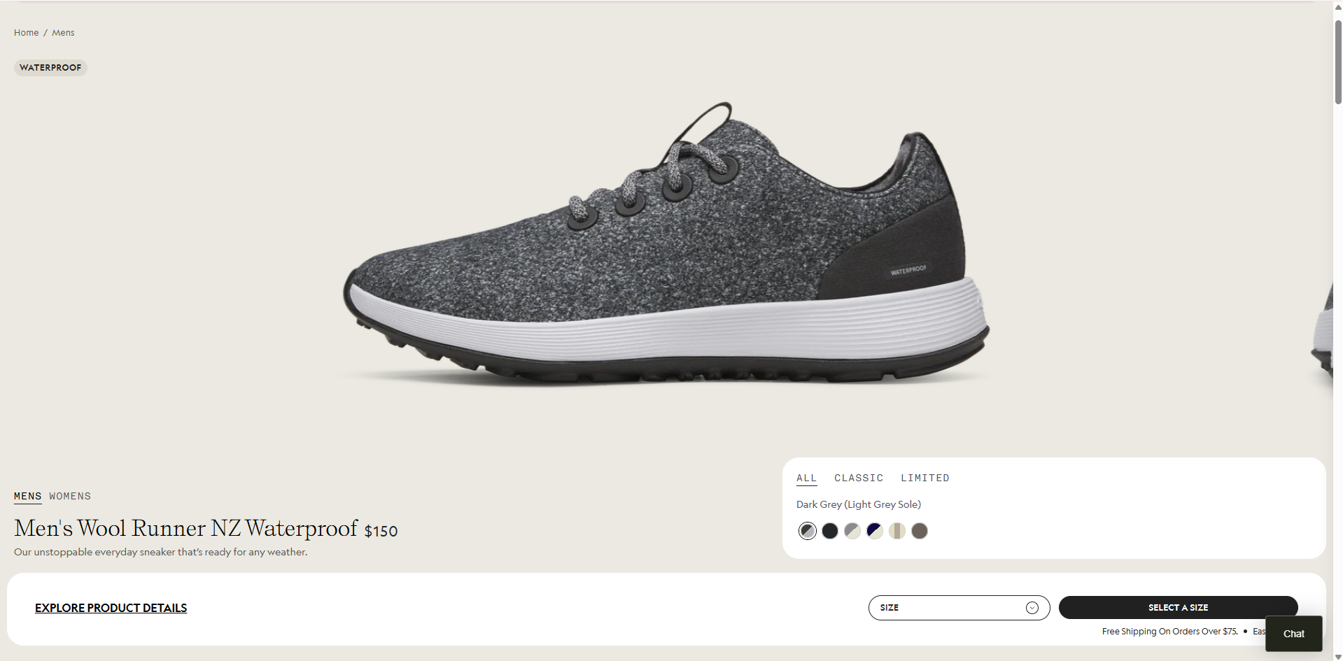
For Example: Allbirds vs. Generic Store
- Generic: “Men’s Wool Running Shoes – Sizes 7–12.”
- Allbirds: “Run Hard. Tread Light. The Wool Runners — soft, sustainable comfort for every step.
Allbirds sells feeling, not fabric. That’s what turns curiosity into commitment.
 Read your product description aloud. If it doesn’t sound like something you’d say to a friend, rewrite it.
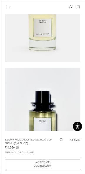
Secret 2: Use High-Converting Product Images & Videos
People buy with their eyes. A great product image does what paragraphs of copy can’t, it builds desire instantly.
What Works Best:
- High-quality images from multiple angles.
- Lifestyle shots showing real use.
- Short videos demonstrating key features.
- Use consistent lighting and brand colors for credibility.
For Example: Dyson
Dyson’s pages use slow-motion demos, transparent product cutaways, and interactive visuals. You can literally see the quality before buying. The result? Higher engagement and fewer returns.
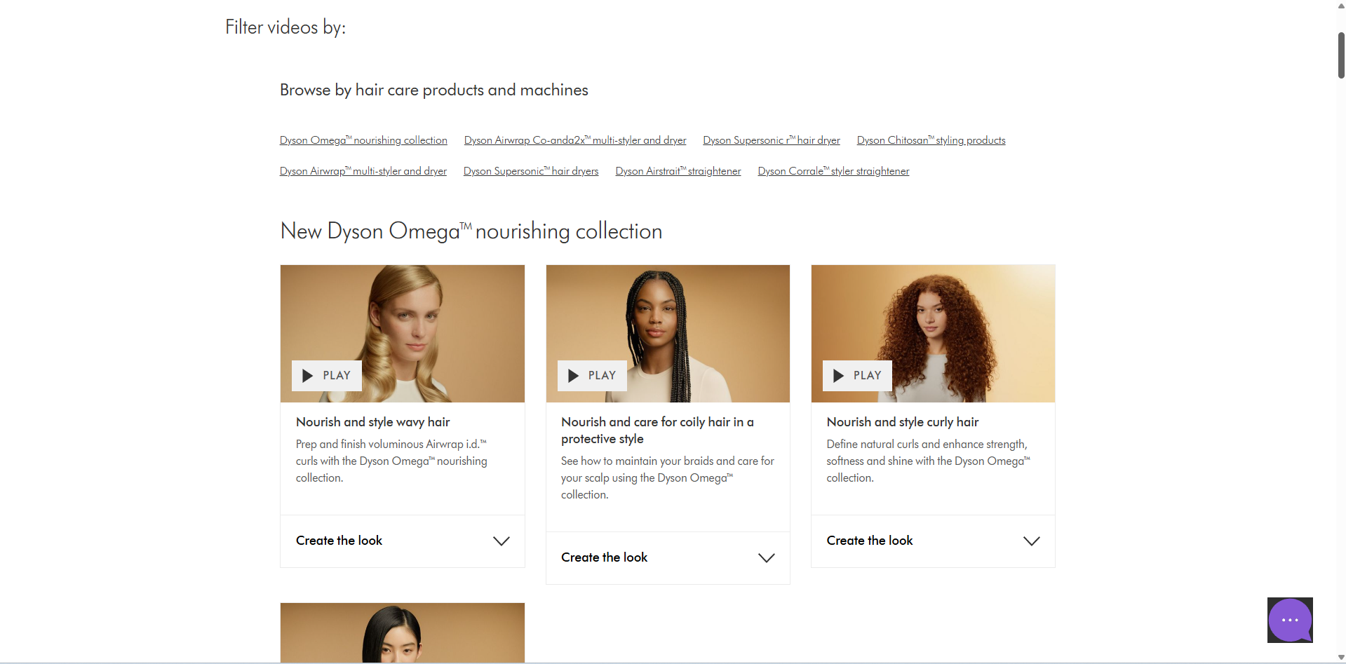
Add a “zoom-in” feature. Shoppers spend 2x longer on product pages that allow close-up views.
Secret 3: Build Trust Through Reviews & Social Proof
Trust drives conversion. Reviews, testimonials, and user-generated content (UGC) are the new currency of credibility. No matter how beautiful your design is, people want validation from other buyers.
Smart Moves:
- Display star ratings clearly.
- Highlight verified purchases.
- Include photos or short videos from real users.
- Pin most helpful reviews to the top.
Example: Glossier
Glossier’s product pages feel like a community. Each product has real user images, ratings, and comments. It’s authentic, relatable, and builds emotional connection.
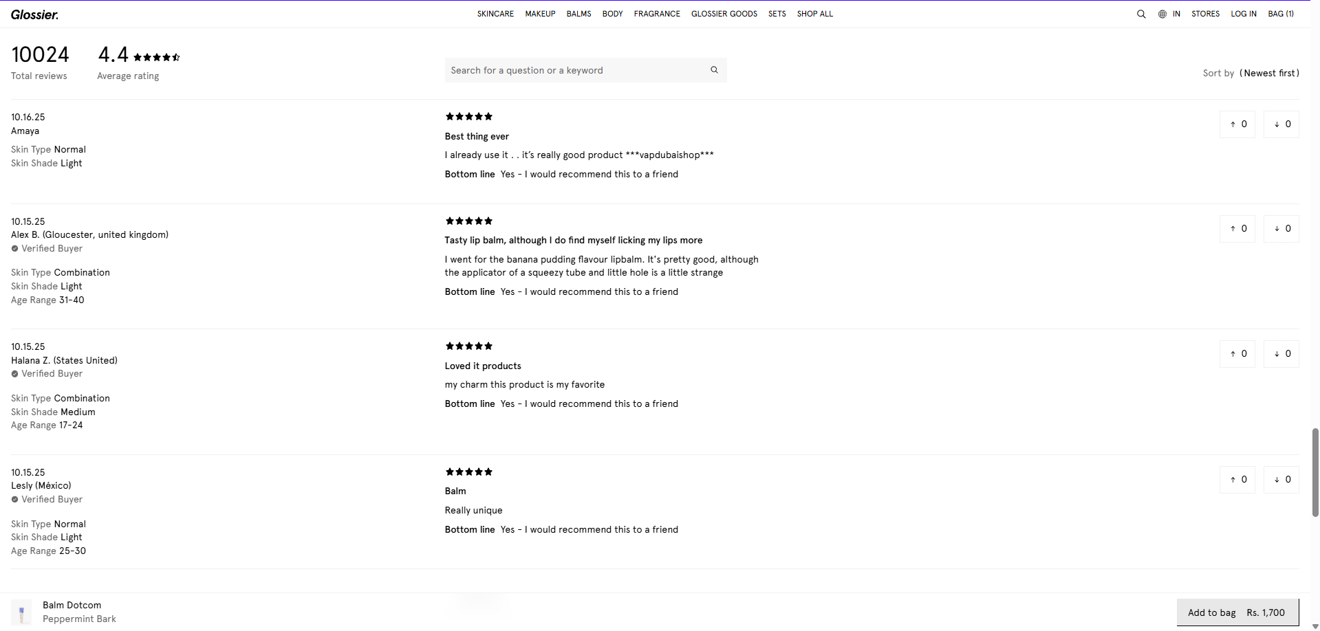
93% of consumers say online reviews influence their purchase decisions.
Secret 4: Pricing Psychology & Smart CTAs
Price is a story, not just a number. The way you present your pricing can either create urgency or indifference.
Proven Tactics:
- Charm pricing: Use $49 instead of $50.
- Anchoring: Show “Was $89, Now $59.”
- Scarcity: “Only 3 left in stock!”
- Urgency: “Sale ends in 2 hours.”
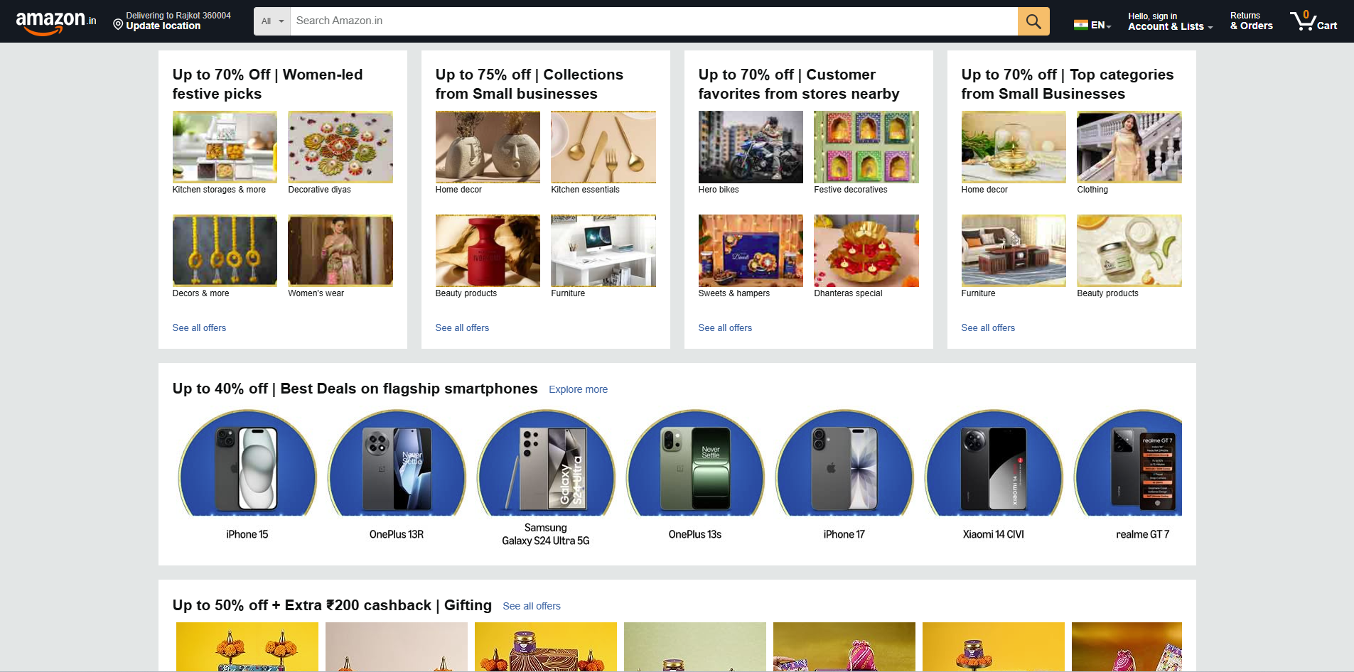
Example: Amazon
Amazon uses every trick in the book real-time inventory alerts, countdown timers, and contrasting colors for CTAs. The “Buy Now” button is always visible and emotionally charged with instant delivery promises.
Test CTA copy. “Add to Cart” performs differently than “Get Yours Today.” Try A/B testing to see what works best for your audience.
Secret 5: Simplify Navigation & Page Speed
Your product page should feel effortless. Every second of confusion or delay increases bounce rate.
How to Simplify:
- Keep the layout clean and linear.
- Ensure the “Buy” button is visible without scrolling.
- Use sticky CTAs on mobile.
- Remove unnecessary popups and widgets.
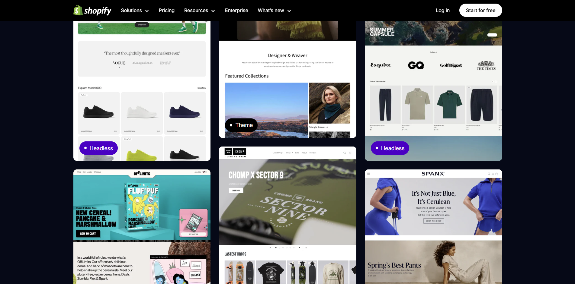
Example: Shopify Store Optimization
A Shopify beauty brand reduced load time from 6 seconds to 2.1 seconds and saw 28% more conversions in one month. Speed sells literally.
53% of mobile users abandon pages that take longer than 3 seconds to load.
Secret 6: Use Data to Continuously Improve
Here’s the real secret that top eCommerce brands never skip: they don’t guess, they test. Your product page is never “done.” It evolves based on what your customers actually do.
What to Track:
- Heatmaps: Tools like Hotjar show where users click or drop off.
- Scroll depth: Are people reading your descriptions or bouncing early?
- A/B tests: Try different headlines, images, and CTAs.
- Analytics: Track conversion rates by device, country, and traffic source.
Example: Nike’s A/B Testing
Nike frequently tests layout variations on product pages, even small things like colour order or CTA placement. One test improved their checkout completion rate by 14%.
Use analytics not to guess what customers want — but to learn how they behave.
Secret 7: Mobile-First Optimization
Over 70% of eCommerce purchases happen on mobile. If your product page isn’t optimized for small screens, you’re losing big.
Example: Zara
Zara’s mobile experience is smooth, large visuals, quick load, and easy checkout. Their “Add to Bag” button is big, bold, and perfectly placed for thumb reach.
 .
.
Quick Fixes:
- Optimize images for mobile.
- Keep CTA buttons large and clear.
- Reduce text and show key points first.
- Enable one-click checkout (Apple Pay, GPay, etc.)
Wrapping It Up:
At the end of the day, a great product page isn’t just about pretty visuals or clever words, it’s about building trust, emotion, and ease into every click. When your page tells a story, shows authenticity, and makes buying effortless, you don’t need to push customers, they choose you naturally. Every element, from your images to your CTAs, should guide visitors toward one clear action: saying “yes” to your product.
The brands that win online aren’t the ones shouting the loudest, they’re the ones who understand how people think, feel, and decide. By combining great storytelling, real reviews, smart pricing psychology, and data-backed optimization, your product page can become your most powerful salesperson, one that works 24/7 and never stops closing.
Remember, your next big sale isn’t about chasing more traffic. It’s about turning the traffic you already have into loyal customers who can’t wait to click “Buy.”
Your next big sale isn’t about more traffic. It’s about better product pages.