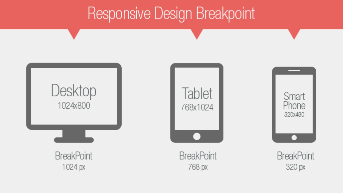
What is a breakpoint in responsive design?
In responsive design, a breakpoint is the “point” at which a website’s content and design will adapt in a certain way in order to provide the best possible user experience.
Essentially, breakpoints are pixel values that a developer/designer can define in CSS. When a responsive website reaches those pixel values, a transformation (such as the one detailed above) occurs so that the website offers an optimal user experience.
- For developers, a breakpoint is a media query.
- For designers, it is the juncture at which a change is made to the way the website content or design appears to the viewer.
When should a Responsive Breakpoint be added?
A good rule to follow in this regard is to add a breakpoint when the content looks misaligned.
Visualize a paragraph of text. As the screen gets wider, it starts to become distorted, thus hindering readability. Adding a breakpoint here would prevent this from happening. The point of adding any breakpoint is to make content easy to read. This applies to both increasing and decreasing screen width. Whenever the content becomes harder to read because of changing screen size, add a breakpoint.
Did you know: How to test your website on different screen sizes using free tools? Find out.
Best Practices for adding Responsive Breakpoints
A. Develop for mobile-first
By developing and designing mobile-first content, the developer and designer receive multiple benefits.
- It is more difficult to simplify a desktop experience for mobile screens than it is to expand a mobile view for desktop screens. When a design is mobile-first, developers address what is most necessary, and can then make additions to match the preferences of desktop users.
- Since mobile devices are more challenging to design for due to smaller screens, developers and designers will end up making the tough choices at the very beginning. This saves them time later.
- The load time of a page is much higher when one starts with CSS and smaller assets.
- Developers and designers are compelled to take into account functional differences occurring between different devices. For example, certain devices prioritize voice search while others are more proficient with a keyboard or even a touchpad.
- There is less coding involved since block-level elements such as a div, heading or section expands to fill 100% of it’s parent by default. Thus, most content will fit a mobile screen automatically.
Use the following points to reduce friction
- Prioritize important menu options
- Remove anything visually distracting
- Remove minor form fields
- Highlight the main CTA
- Focus on a robust search and filter function.
- Always keep major breakpoints in mind. The former usually matches common screen sizes (480px, 768px, 1024px, and 1280px).
- Before choosing major breakpoints, use website analytics to discern the most commonly used devices from which your site is accessed. Add breakpoints for those screen sizes first.
- An intelligent method is to hide or display elements at certain breakpoints. If necessary, switch content or features at breakpoints. For example, consider implementing off-canvas navigation for smaller screens and a typical navigation bar for larger ones.
- Don’t define standard breakpoints for responsive design on the basis of device size. The primary objective of responsive design breakpoints is to display content in the best possible way. So, let the content be the guide. Add a breakpoint when the content and design requires it.
People also ask: What is the ideal screen size for responsive design? Find out.
Screen Size Commonly used in 2021
While there is no standard for defining responsive breakpoints because of the large number of devices in the market, devices with the following screen sizes have been most commonly used in 2021 across the world
- 1920×1080
- 1366×768
- 360×640
- 414×896
- 1536×864
- 375×667
Try Responsive Testing on all Screen Sizes for Free
The amount of effort that goes into defining responsive breakpoints is directly proportional to the experience of the end-user. Keep in mind that users expect any website to be perfectly complementary with every single device they own – desktop, tablet, or mobile. If a website’s responsive design does not align with a certain device resolution (especially a commonly used device), the site is at risk of missing out on a segment of its target audience. Avoid this by investing time and research into defining breakpoints at the beginning of a project.
When defining and implementing breakpoints, it is important to check how the website appears on a range of devices. As far as possible, test responsive design on real devices, to verify what the design will look like exactly to end-users.
BrowserStack’s responsive design checker provides an easy way to verify responsive design. Simply enter the URL, click Check and receive a view of the site on multiple real devices, both desktop, and mobile. Ensure that your responsive design breakpoints are placed